關於我們
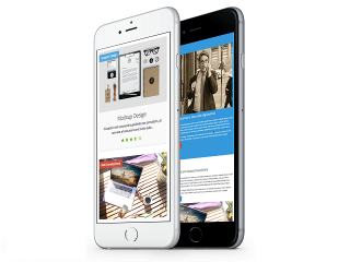
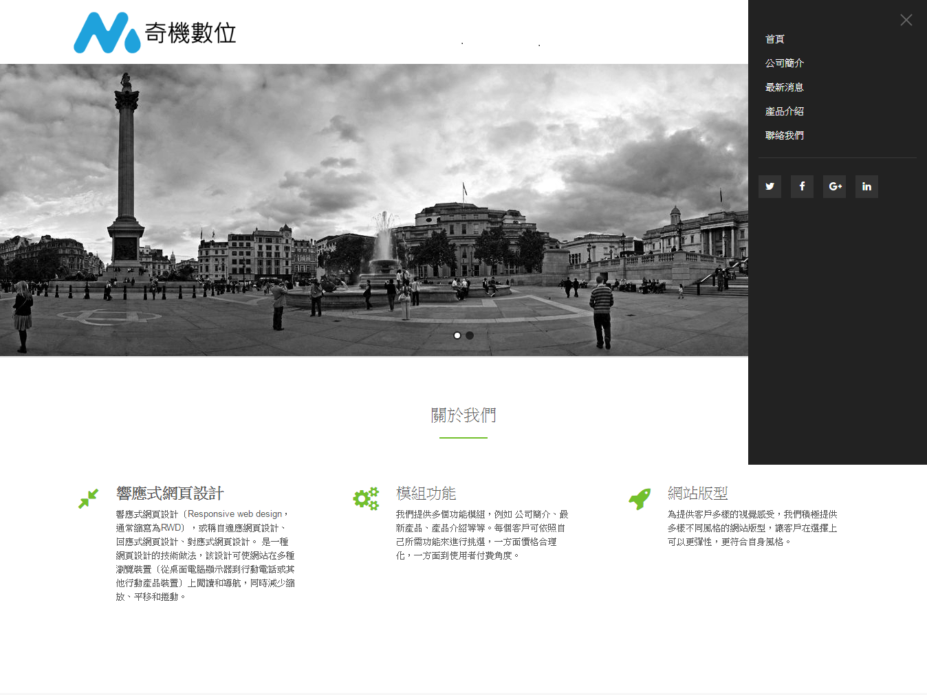
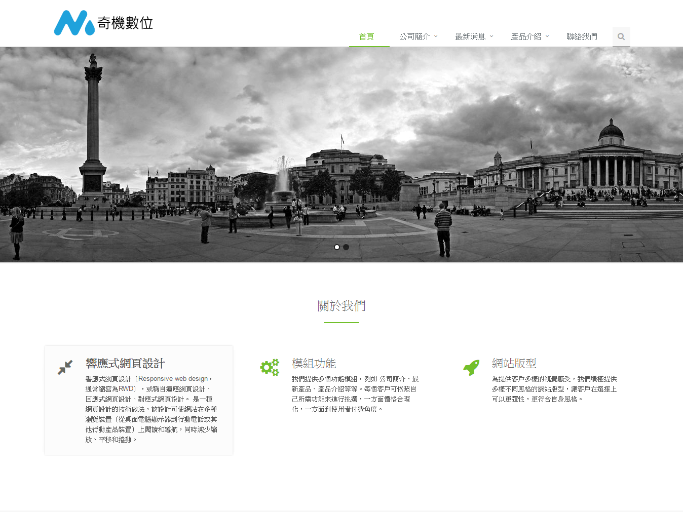
響應式網頁設計
響應式網頁設計(Responsive web design,通常縮寫為RWD),或稱自適應網頁設計、回應式網頁設計、對應式網頁設計。 是一種網頁設計的技術做法,該設計可使網站在多種瀏覽裝置(從桌面電腦顯示器到行動電話或其他行動產品裝置)上閱讀和導航,同時減少縮放、平移和捲動。
模組功能
我們提供多個功能模組,例如 公司簡介、最新產品、產品介紹等等。每個客戶可依照自己所需功能來進行挑選,一方面價格合理化,一方面到使用者付費角度。
網站版型
為提供客戶多樣的視覺感受,我們積極提供多樣不同風格的網站版型,讓客戶在選擇上可以更彈性,更符合自身風格。
NEWS LATEST
If you are going to use a passage of Lorem Ipsum, you need to be sure there isn't anything embarrassing hidden in the middle of text. All the Lorem Ipsum generators on the Internet tend to repeat predefined chunks as necessary, making this the first true generator on the Internet.

17 Jan
3Make a Type Specimen Book's
Lorem Ipsum is simply dummy text of the printing and type setting industry. Lorem Ipsum has been the industry's standard dummy text ever since the 1500s, when an unknown printer took a galley of type and scrambled it to make a type specimen book.

05 Sep
Make a Type Specimen Book
Lorem Ipsum is simply dummy text of the printing and type setting industry. Lorem Ipsum has been the industry's standard dummy text ever since the 1500s, when an unknown printer took a galley of type and scrambled it to make a type specimen book.

24 Aug
Printing and Type Setting Industry
Lorem Ipsum is simply dummy text of the printing and type setting industry. Lorem Ipsum has been the industry's standard dummy text ever since the 1500s, when an unknown printer took a galley of type and scrambled it to make a type specimen book.
NEW PRODCUT
If you are going to use a passage of Lorem Ipsum, you need to be sure there isn't anything embarrassing hidden in the middle of text. All the Lorem Ipsum generators on the Internet tend to repeat predefined chunks as necessary, making this the first true generator on the Internet.


